INTERIORS: A Haven of Peace – Colouring an English Home for Calm

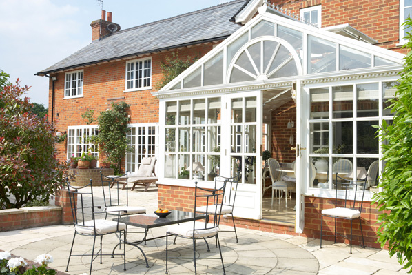
In a world that hums too loudly, the most radical luxury is a quiet home. 

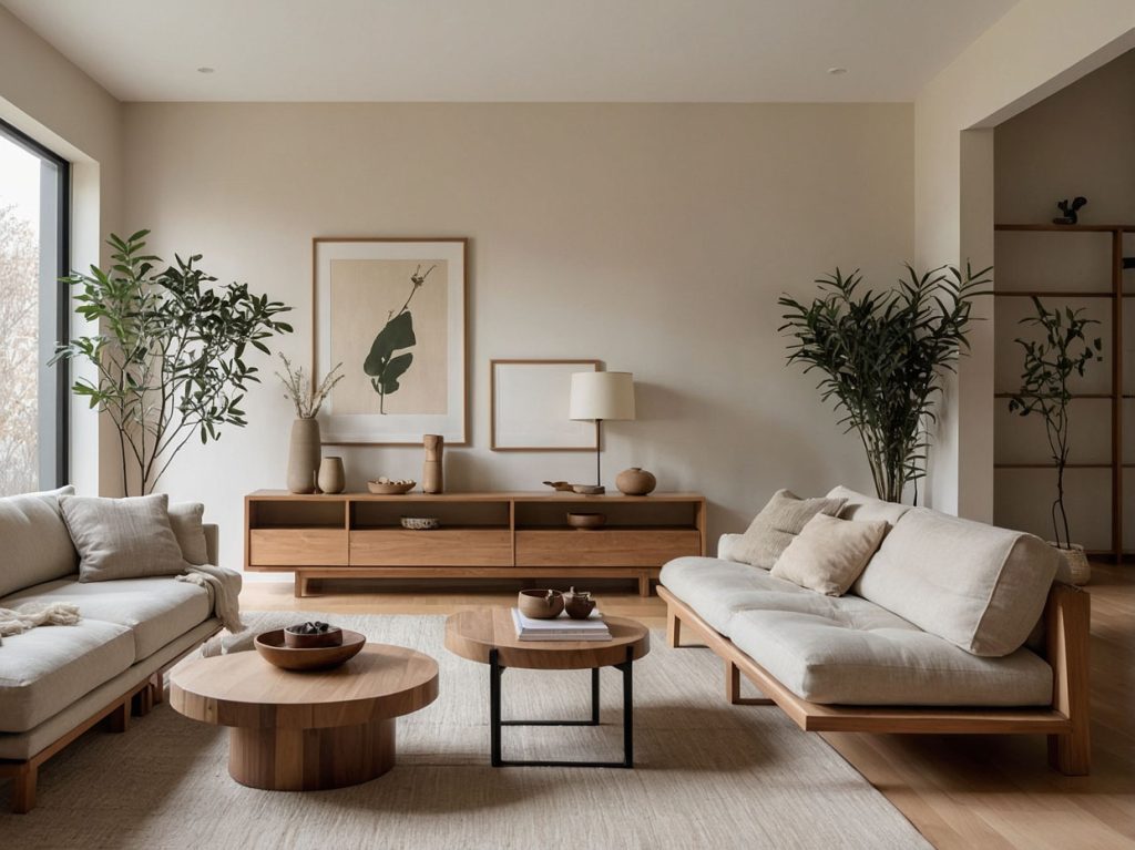
In England, where the light can be soft and cool, calm design is less about stark minimalism and more about gentleness: hues with softened edges, natural textures, and patterns that breathe. The goal is not to impress but to exhale – rooms that slow the pulse, not steal the show.

Begin with the light. 

Northern light leans blue, so colours can read cooler than on the tester card. Choose paints with warm undertones – grey-greens with a drop of yellow, stone neutrals touched by pink or mushroom, and blues muddied with grey. 

Aim for low-contrast transitions between walls, woodwork, and ceilings; the eye rests when it isn’t jolted from shade to shade. Flat or matte finishes feel softer than high-sheen; soft sheen in kitchens and bathrooms adds practicality without glare.
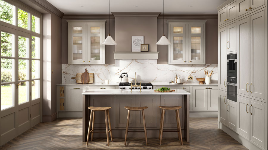
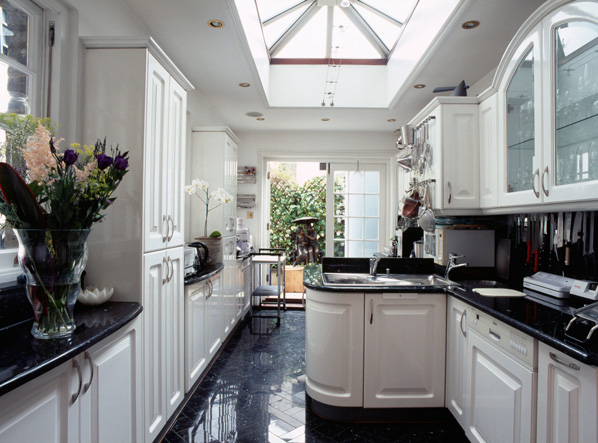
The kitchen: 

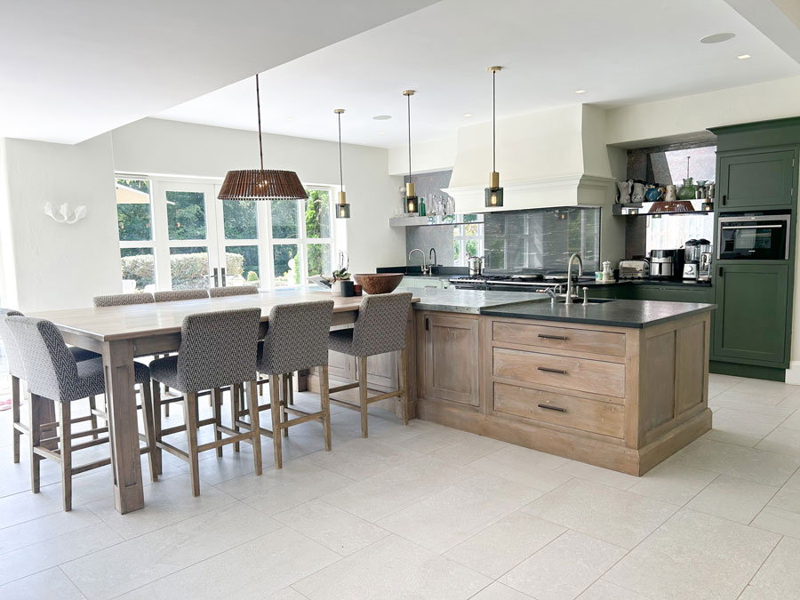
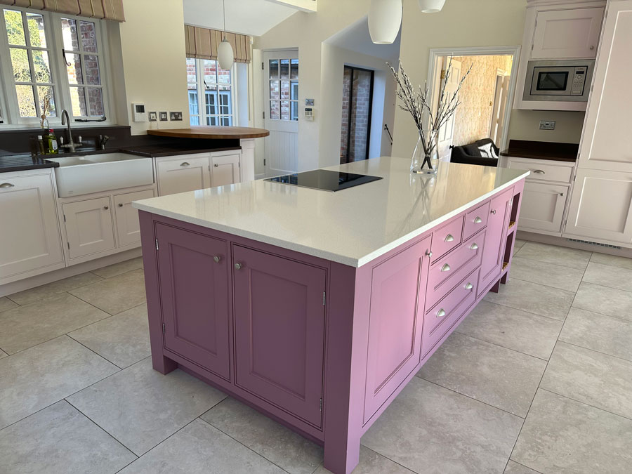
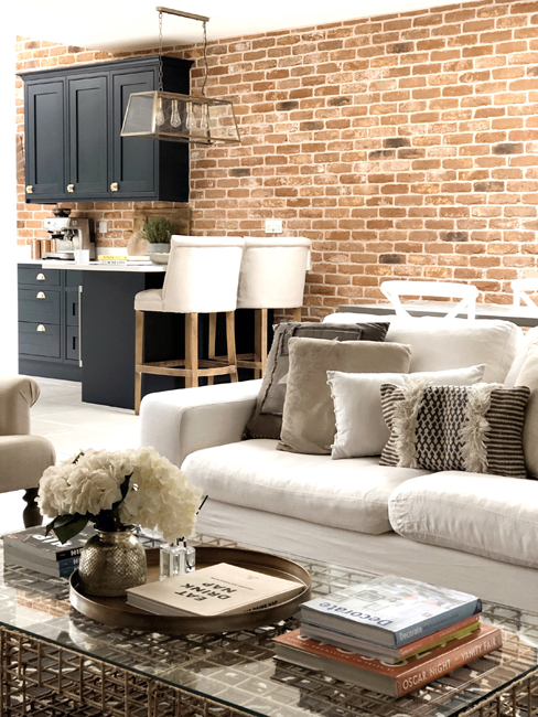
Grounded freshness Kitchens work best as serene workshops – ordered, tactile, and quietly cheerful. Sage and olive greens anchor the room to nature; they pair beautifully with pale, warm neutrals on walls and ceilings.

 Think: mid-sage cabinetry, linen-white walls, and warm oak or honeyed beech accents. If you love blue, choose a greyed, smoky blue for islands or lower units, balanced with creamy off-whites rather than bright whites.

For wallpaper, use it sparingly: a small breakfast nook clad in a delicate botanical or block-printed sprig pattern can soften the hum of appliances. 

Tile with soft, handmade character – chalky zellige in warm white, celadon, or pale eucalyptus – adds depth without noise. Brass or aged bronze hardware warms the palette; keep worktops quiet (oatmeal quartz, honed marble, or wood with a matte oil). Under-cabinet lighting and warm bulbs (around 2700K) keep the space cosy through grey afternoons.

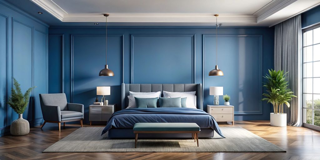
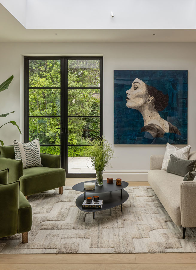
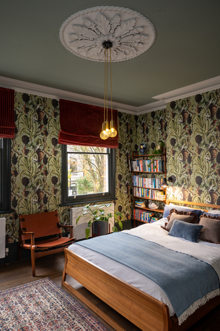
The main bedroom –  cocooning serenity: 

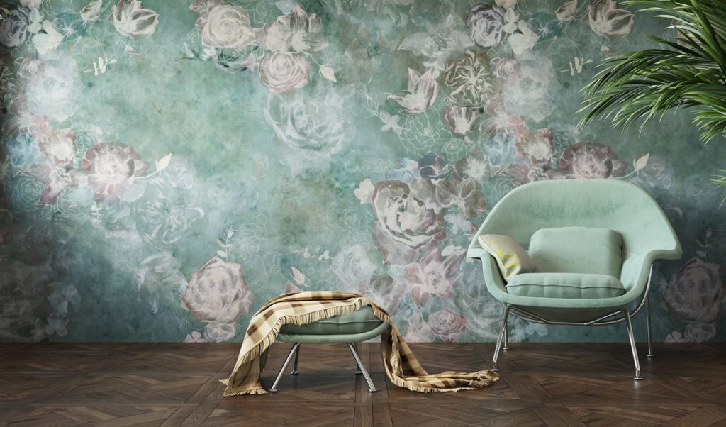
Bedrooms should feel like dusk. Choose enveloping colours – moss, muted teal, warm taupe, or a tender plaster pink – that wrap the room, skirting to ceiling. A mid-tone on walls with a shade deeper on woodwork lends softness and quiet structure. Alternatively, go tone-on-tone: a gentle greige across walls and ceiling, curtains in a slightly darker sibling, bed linen in chalky white and mushroom.

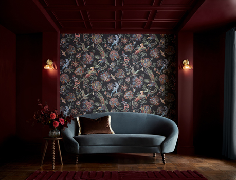
Wallpaper is at its best here. Look for small-scale, hand-drawn florals, willow fronds, or simple stripes in faded tones – patterns that suggest nature without shouting it. If you want to be brave go for a large scale nature inspired wallpaper.

If you prefer plain walls, panel the headboard wall and paint it a few shades deeper than the others for a restful focal point.

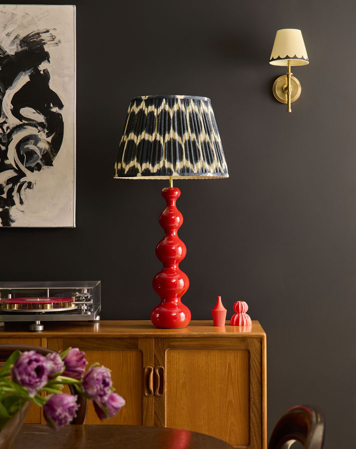
Layer textures that whisper: linen, brushed cotton, wool throws, a tufted rug underfoot. Keep metallics subdued – antique brass over chrome and limit contrast.

Night lighting should be low, warm, and directional; a pendant on a dimmer plus bedside lamps with fabric shades will do more for peace than any colour alone.
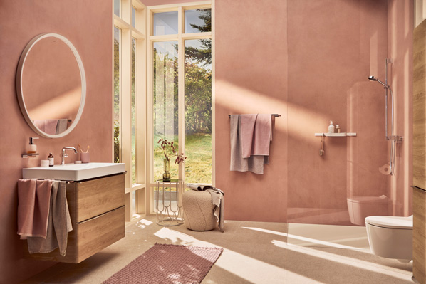
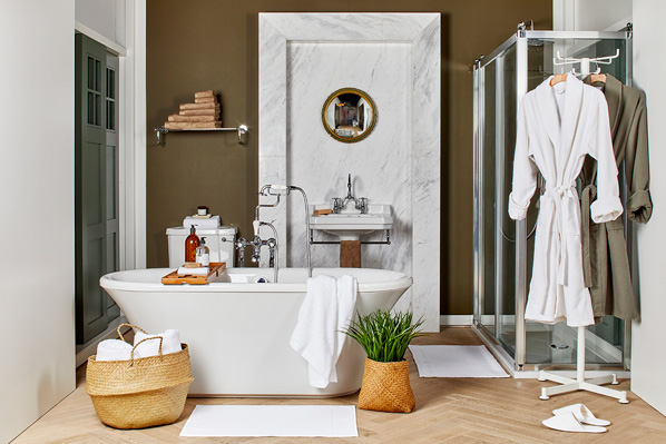
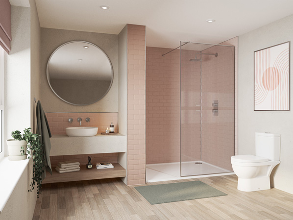
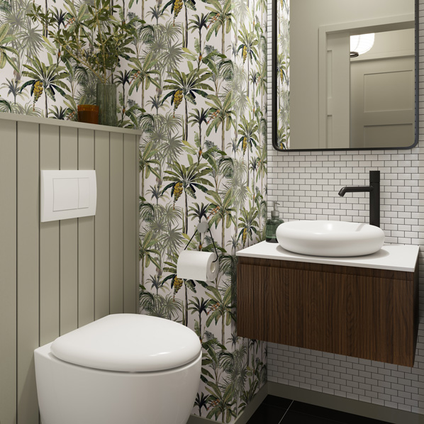
The bathroom: 

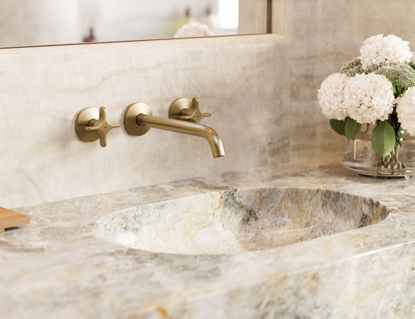
Bathrooms thrive on clarity and softness. Start with a warm white or pale stone on walls, then introduce colour through tiles or a half-height panel in sea-glass green, soft aqua, or clay. 

Avoid icy whites; look for creamy bases and honed finishes to diffuse light. A single gentle hue, pistachio, pale sage, or a whisper-blue across walls and bath panel feels cohesive and fresh.

For pattern, think water and meadow: fine reed stripes, lily pads, or a minimal Japanese wave motif. A small wallpapered cloakroom can carry bolder pattern, but in the main bathroom keep it airy. 

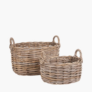
Natural materials – oiled oak shelves, wicker baskets, pebble or terrazzo-style floors add warmth and touch. 

Pulling it together

• Keep a connected palette: three families repeated throughout – grey-green, warm neutral, and softened blue or blush.

• Blur edges: paint ceilings a half-tone of the walls; echo cabinet colours in textiles.

• Prioritise matte, tactile finishes and warm lighting.

• Let pattern be small-scale, nature-led, and slightly faded.

Peace is cumulative: it’s the sum of kind colours, hushed textures, and gentle light. In an English home, where the sky often lends its own soft filter, these choices don’t just decorate; they restore.

Market Update & Latest Property Magazine

Against a backdrop of international turmoil, the UK’s residential sales market, especially in the South East, continues to display striking resilience. 

Even as headlines are dominated by the Iran/US war and its longer-term economic reverberations, transaction pipelines remain active, pricing is broadly stable, and buyer intent appears stubbornly intact across core commuter belts and well-connected towns.

This is not an isolated episode. Recent history shows a pattern: during the Covid crisis, prices rose – most notably for homes with gardens, workspace, and access to green space, as buyers reassessed priorities. The war in Ukraine sent shockwaves through energy markets and inflation, yet the UK housing market absorbed the blow better than many expected. While mortgage costs did rise and activity cooled in segments, outright distress was limited and values generally held, particularly where schools, transport, and amenities underpin demand.

Several fundamentals help explain this durability. Chronic under supply, especially in the South East, supports prices even when sentiment wavers. A tight labour market and accumulated household savings cushions demand. The prevalence of fixed-rate mortgages slows the pass-through of shocks.  In addition high rents nudge would-be buyers toward ownership despite rate headwinds. 

International uncertainty can also redirect capital toward perceived safe, rules-based jurisdictions – prime UK housing often benefits.

The Real / 'Shop Floor' Local Market

Tthere is a deeper, human explanation. After years of rolling crises, many households seem unwilling to let distant geopolitics permanently defer life decisions. 

If home owners and buyers cannot influence the news cycle, they can still shape their immediate future: moving closer to family, trading space for commute, or finally securing that garden. This pragmatic optimism, tempered by careful budgeting and realism on price, helps keep chains moving.

No market is fully insulated. Yet the UK housing story, and the South East in particular, continues to show that clear needs, finite supply, and determined buyers can outweigh even a noisy global backdrop.

moving home remains a priority

Find A Home To Buy Or Rent

Take a look at our latest digital magazine where we are showcasing some fine properties to buy or rent. Buyers can see homes from £350,000 to £2,500,000, and for renters some simply stunning homes are available.

In this issue some of our editorial content includes insights into what might be going on in the mind of a house buyer with a classic car collection, a barbecue recipe with a Caribbean twist, interior design and some thoughts in how to modernise an outdated 1970’s /1980’s bathroom.

Just click here or on the image below to go to our 150 page flipping book digital magazine….

How the Colour Palette in Your Home Can Affect Your Mood

The colours you surround yourself with every day quietly influence how you think, feel, and behave. While furniture and layout shape function, colour shapes emotion. From calming blues to energising yellows, your home’s palette can either support your wellbeing — or subtly work against it.

Understanding how colour affects mood allows you to design spaces that feel intentional, balanced, and aligned with how you want to live.

Blue: Calm, Focus, and Emotional Ease

Blue is widely associated with tranquillity and stability. Lighter shades create an airy, open feeling, while deeper tones like navy feel grounded and secure. Psychologically, blue can slow the heart rate and encourage relaxation, which is why it works so well in bedrooms and bathrooms.

In workspaces, softer blues can also improve concentration and mental clarity. However, very dark or cool-toned blues may feel distant if not balanced with warm lighting or natural textures.

Yellow: Warmth, Optimism, and Energy

Yellow carries the warmth of sunlight and tends to evoke positivity and energy. In kitchens and dining areas, it can create a welcoming, sociable atmosphere. In creative spaces, it may spark inspiration and mental stimulation.

That said, intensity matters. Soft buttery tones feel uplifting and gentle, while overly bright yellows can become overwhelming over time. The key is moderation and thoughtful placement.

Green: Balance and Restoration

Green sits at the centre of the colour spectrum and is one of the most restful shades for the human eye. Because it is strongly linked to nature, it often promotes a sense of renewal and harmony.

Soft greens such as sage or eucalyptus can make a bedroom feel calm and restorative. Richer shades like emerald introduce depth and sophistication while still maintaining a sense of balance. Green is particularly effective in living spaces where relaxation and connection are priorities.

Red: Passion and Stimulation

Red is emotionally intense and physically stimulating. It can increase energy levels and encourage

conversation, which makes it well suited to dining rooms and social spaces.

Because red is so powerful, it is often most effective as an accent colour. Used thoughtfully — perhaps on a feature wall or in décor elements — it adds warmth and vibrancy without overwhelming the room.

Neutrals: Space to Breathe

Neutral tones such as white, beige, taupe, and soft grey create a sense of simplicity and calm. They allow a room to feel open and uncluttered, offering visual rest in a busy world.

However, neutrals are not automatically soothing. Cool, stark whites can feel clinical, while overly flat greys may appear dull. Texture, layered lighting, and natural materials are essential to bring warmth and dimension into a neutral space.

The Power of the Overall Palette

Individual colours matter, but the overall composition of your palette shapes the emotional atmosphere of a home. Cool-toned schemes tend to feel restful and serene. Warmer combinations create energy and sociability. High contrast adds drama and stimulation, while monochromatic layering produces cohesion and calm.

Lighting also plays a significant role. Natural daylight softens and clarifies colour, while artificial lighting can dramatically shift undertones. Testing samples at different times of day is always wise.

Designing with Intention

Choosing a colour palette should begin with a simple question: how do you want to feel in this space? A bedroom might prioritise calm and comfort, while a dining room might benefit from warmth and vibrancy. A home office may require clarity and focus.

When colour choices align with the purpose of a room, your home becomes more than visually appealing — it becomes emotionally supportive. Thoughtful use of colour can improve rest, boost creativity, enhance sociability, and create an atmosphere that feels authentically yours.

Ultimately, colour is not just decoration. It is a powerful tool that shapes your everyday experience in subtle but meaningful ways.

4 simple styling tricks to put a stamp on your space

From ambient lighting to shelving and rug rules, pro tips to enhance your decor. By Sam Wylie-Harris.

Flick through any glossy interiors magazine and it’s easy to get carried away with what’s trending; especially with a string of decorative ideas to spur your creativity.

But it can be a bit of a reality check, and you end up asking yourself: How can I express myself so it’s about me… as much as it is the decor?

Given all this – and depending on your design ethos – Lara Clarke of Lara Clarke Interiors says it’s about taking a personal approach with clients: “It’s a collaborative process – instead of putting our style on you, we pull your style out.

“We work with you to try and create something that’s essentially yours and unique, and not a carbon copy of everything else.”

From how you live, to a fabric you love, to where you’re going to be sitting with a cup of tea in the morning, the Surrey-based designer says those sorts of things are really important.

“We get into the nitty gritty detail… how this home is going to work for you as a family, and how it’s going to work best for you – and not for anyone else.”

An advocate of how simple styling tricks make a room feel more expressive, Clarke shares her top tips to inspire creatives and interior enthusiasts…

1. Layered lighting

One of the key things is lighting. “A lot of people might just have downlights; but if you layer your lighting, it makes a huge difference.”

Clarke suggests using a rechargeable wall lighting – flexible and cordless, simply mount a bracket or use strong adhesive – think brass sconce and decorative shade.

“You just put it on your wall, and instantly you’ll have some wall lights… it’s a great way to layer lighting in your home.”

“Table lamps are another one,” suggests Clarke. “On a table, go for a different lampshade.”

So if you buy a table lamp from John Lewis for example, she suggests choosing your own designer lampshade. “It elevates that lamp in a way an ordinary, plain white shade wouldn’t.”

She also prefers to add colour. If you’re not painting the walls and want to refresh your space by influencing the mood, Clarke says it’s another tool to add colour and pattern.

“I like using coloured lampshades in my designs, I kind of link with the scheme… a plain white one can be boring; but a patterned lampshade makes a big difference.”

2. Shelving & placement

To style your shelves and place accessories just so, the designer says it’s good to have a mixture of taller things, think photos, books, and suggests including some flowers within the scheme.

“Sometimes people tend to stuff it full when actually less is more.”

And if you’re torn between symmetry and scale, it’s an equilibrium. “So if you’re looking at a shelf or bookcase as a hole, there will be some elements of symmetry.

“But you don’t want everything to be symmetrical, because then it will feel too staged, there needs to be a balance between both.”

Clarke likes to do a mixture. “I put a lot of books flat, and then it’s nice to have something on top of them.

“If you have some books you want to balance, and they’re stacked on top of one another, then balance that with an object, vase or candle on top.”

3. The secret to scatter cushions

“I think cushions is one of those massive areas where it can completely change the look of your room,” highlights Clarke.

“The key is to get a quality cushion with a good plump; you can buy cushions from the high street, but they won’t have a nice feather insert.”

Therefore, if you’re buying a cushion cover, she says to buy a feather insert one size bigger. “So you stuff it, and then your cushion looks fuller than if you were to buy the corresponding insert which normally looks a bit flat.

“It makes the cushion look more expensive, I like a very plump cushion, it’s more luxurious rather than something limp on the sofa,” she quips.

Moreover, Clarke says you can never have too many cushions. “It’s a really good way to add colour and interest to potentially a plain sofa.”

4. Rug rules

When it comes to do’s and don’ts, the designer says a lot of people always buy a rug too small for the space. “And actually, it makes the space look a bit smaller if anything.

“So you want to oversize your rug… you don’t want it to look like a doormat under your coffee table.”

Ideally, she says to have most of the furniture sitting on it. “So that would be your sofa, your side tables, your accent chairs, if possible – but if in doubt, bigger is better.”

“You want to zone the space by including the furniture within that,” she says confidently.

Why 2026 kitchens are all about warmth and comfort

If you’re looking at your kitchen in a whole new light, and thinking about a different theme or concept, there’s a growing movement towards spaces that prioritise comfort and warmth.

“Think muted tones, soft furnishings, and a modern take on traditional design,” says Looeeze Grossman, founder of The Used Kitchen Company.

“Homeowners are looking for kitchens they actually enjoy being in, not just ones that look good on social media.”

Think relaxed, casual and harmonious blend of traditional and modern. Here’s how to create a space which feels congenial and bang up-to-date…

Painted kitchens

“The days of high gloss finishes are behind us for now,” says Grossman. “Painted kitchens have made a huge comeback thanks to their adaptability and timeless quality, whether solid wood or MDF.

“Painted doors in warm, comforting tones set the foundation for this new aesthetic,” explains Grossman.

Look for shaker-style details, vintage or reclaimed handles and warm tones to “create kitchens that look effortlessly chic and packed with warmth”.

Painted kitchens also open up your tile and worktop choices, highlights Grossman. “From wood to striking quartz, composite or porcelain worktops – all pair beautifully.

“Vintage mirrored splashbacks can add a modern twist, as can tiles laid in an intricate herringbone pattern, over the metro tiles [aka subway tiles] we’ve often seen in kitchens in recent years.”

Muted tones

It’s also time to switch out bright white and stark grey worktops. Grossman says she’s seeing a move towards warmer neutral tones.

“The beauty of a cosy kitchen is that everything should work within one colour palette.

“Nothing has to fight for attention, it all blends seamlessly, creating a natural warmth with a combo of paint colours and worktops.”

Moreover, she says bringing in living colours such as greens and beiges gives the space life, especially when used tonally in different shades.

“If you’re opting for a bold splashback or door colour, you can soften the look with blankets and seating cushions in lighter tones,” Grossman suggests.

Lighting is another key aspect, and extends to choosing softer lighting over the brightness of spotlights.

“Think vintage pendants over an island, and lamps on the walls. If you do opt for some spotlights, make sure they’re dimmable to create a warm, inviting atmosphere,” she advises.

Storage

When it comes to cosy storage, Grossman says it’s all about natural materials which complement each other.

“Natural wicker baskets instantly add warmth and texture over harsh plastic or metals.

“Glass jars with cork lids and simple ceramics look extremely attractive for storage on an open shelf; or creating a tidier larder.”

She continues: “Wicker works well for napkins, cutlery, and vegetables that don’t need to be refrigerated; glass and ceramics are ideal for dry ingredients.”

Open shelves

As Grossman points out, cosiness is as much about emotion as it is about design.

“Open shelving lets you display the things that matter… your favourite mugs, or tea set you spent ages finding.

“These are the things that give your kitchen personality and memories that define the cosy trend.”

To get the look, she suggests displaying your vases, showcasing your mug selection, and having stemware on show.

“But don’t mistake this as a time to over-clutter,” she warns. “Cosy kitchens still have style – pick your favourite pieces, add them to your shelves, and enjoy the display.”

Seating should be comfortable

Uncomfortable stools, plastic chairs, or benches without a back don’t belong in a cosy kitchen, underlines Grossman.

If replacing them isn’t an option, she says to soften what you have. “Add upholstered bench pads in soft muted shades that bring warmth and country cottage-style elegance.”

Team with throws and cushions to create a relaxed, welcoming feel. “If you have bar stools, opt for a cushioned topper so people will actually want to sit down.

“And if your kitchen opens onto your garden, match your indoor soft furnishings to your outdoor cushions to create a sense of continuity.”

As Grossman puts it: “A cosy kitchen is a kitchen you’ll want to spend time in – it won’t feel cold or stark.

“You’ll want to light a candle and snuggle up in the corner with a cup of coffee and a good book; or sit chatting for hours over a glass of wine with friends.”

She continues: “It’s about creating an emotional connection to the space that goes beyond just cooking… it’s a space that you want to live and be in.”

Home design trends for 2026

McCarthy Holden INTERIOR TRENDS 2026

Looking for ideas on how to keep your decor and interior styling bang up-to-date?

With the focus on new horizons, home and design platform Houzz has gathered insights from its community of homeowners, designers and home improvement professionals to forecast the top home design trends for 2026.

Reflecting a desire for spaces that balance character with comfort, here’s a look at the styles we expect to gain momentum in the year ahead…

(by Sam Wylie-Harris, PA)

.

Heritage maximalism

McCarthy Holden INTERIOR TRENDS 2026
Mel Massey Studio/David Giles Photography/PA.

“Maximalist interior design has been gaining momentum among UK homeowners for some time, but we expect a heritage-driven twist to emerge,” reveals Kiya Kelly-Paine, Houzz home design trends expert.

“Known as ‘heritage maximalism,’ this design style incorporates nods to British roots while layering in contemporary sensibility, to create a timeless, modern appeal,” she explains.

“Think bold colour palettes, historical motifs and ornate detailing, from furnishings to finishes.”

Mel Massey, founder of Mel Massey Studio, says: “We’ve noticed more clients embracing bold interior design choices, from richly detailed wallpaper and patterned upholstery to dramatic hues.

“At the same time, homeowners are layering in modern touches to personalise their spaces,” highlights Massey.

While these choices may have once felt intimidating, she says visualisation tools such as mood boards give homeowners “the confidence to combine these elements into a look that feels curated, not chaotic.”

.

McCarthy Holden INTERIOR TRENDS 2026
Mel Massey Stu-dio/PA.

Hidden spaces and seamless design

McCarthy Holden INTERIOR TRENDS 2026
Space Shack/Chris Snook/PA.

Whether you’re looking to optimise smaller spaces or simply minimise clutter, Kelly-Paine says smart design features, “such as tucked-away home bars and concealable built-ins, can help you achieve a more streamlined, sophisticated look.”

“These hidden spaces give homeowners the best of both worlds: functional features when you need them and seamless design when you don’t,” she adds.

Omar Bhatti, founder and design director at Space Shack says: “As our clients look to personalise their homes, requests for bespoke joinery are becoming more common.

“Not only do these custom solutions add character, but they’re practical and tailored to fit our clients’ lifestyles.”

McCarthy Holden INTERIOR TRENDS 2026
Omar Bhatti Space Shack/PA.

Immersive visualisation becomes the new blueprint

McCarthy Holden INTERIOR TRENDS 2026
Brick and Stone Interiors/PA.

Homeowners and design professionals alike are increasingly relying on 3D modelling to convey their ideas and explore possibilities, notes Kelly-Paine.

“These visualisation tools are mutually beneficial for homeowners and professionals, as they help to set and manage clear expectations throughout the course of a project,” she explains.

Laura Evans, founder and interior designer at Brick and Stone Interiors, says: “Visualisation tools like 3D floor plans have been a game changer for me and my clients.

“By bringing concepts to life, digital models give my clients a realistic picture of what to expect,” says Evans. “Not only does this ensure we’re aligned throughout the process, but it also helps them communicate any changes proactively.”

McCarthy Holden INTERIOR TRENDS 2026
Kiya Kelly-Paine Houzz/PA.

Soft simplicity

As homeowners seek to create calming sanctuaries within their homes, Kelly-Paine says photos featuring cocooning spaces with layered neutrals, organic materials and tactile finishes are among the most popular images on Houzz.

“Together, these elements create a warm, welcoming atmosphere that feels both comfortable and relaxed.”

Evans agrees: “In recent years, our clients have been gravitating toward ‘organic modern’ style, from the bedroom to the kitchen, and everywhere in between.

“As they look to create a softer take on minimalism, homeowners are introducing warm neutrals, texture and organic shapes to create serene, restorative spaces.”

She continues: “We expect to see that trend continue, as it’s a widely adaptable aesthetic that works well across home design styles.”

McCarthy Holden INTERIOR TRENDS 2026
Yoko Kloeden Design/Anna Statha-ki/PA.

The return of dark wood

“Dark wood tones such as walnut and mahogany are re-emerging, as homeowners strive to bring a sense of depth to their interiors,” says Kelly-Paine.

Moreover, she says searches on Houzz reflect this resurgence, with googling for ‘dark wood’ rising 187% in the first three quarters of the year compared with the same period in 2024.

Bhatti says: “For years, many homeowners have favoured lighter wood tones and whitewashed finishes, but recently clients have been showing an interest in deeper, more dramatic wood tones.

“Whether that be for kitchen joinery, bespoke built-ins or even wall cladding. To offset darker wood tones, we often pair them with warm metals or textured stone for a more balanced look,” he explains.

McCarthy Holden INTERIOR TRENDS 2026
Hub Interiors/Landford Stone/Oliver Smith/PA.

Transparent renovation projects

Kelly-Paine says research shows homeowners are eager to have more transparency throughout the renovation process. “41% said a clearer timeline would have improved their project experience.

“And almost the same share wanted better communication from their pros (40%).”

Indeed, Bhatti says access to a real-time communication platform has been instrumental with his clients. “It makes for much smoother collaboration; clients stay informed with access to real-time project updates and as a result, they feel less stressed and more empowered throughout the process.

“Considering how effective it is, I’d expect this type of collaborative software to be adopted more widely across the industry.”

McCarthy Holden INTERIOR TRENDS 2026
Mel Massey Stu-dio/David Giles Photography/PA.

Lighting as art

From sculptural alabaster pendants to playful glass forms, homeowners are introducing statement lighting to transform their spaces in more ways than one, outlines Kelly-Paine.

“Of course, lighting plays the functional role of illuminating a space, but when thoughtfully selected and positioned, lighting fixtures can be standalone works of art.”

Massey says: “Lighting fixtures have become more of a focal point among our clients, as they look to infuse personality or even a bit of drama into their spaces.

“For anyone considering statement lighting, it’s worth using visualisation tools to understand how a fixture will sit within the space before making a final decision,” she advises.

McCarthy Holden INTERIOR TRENDS 2026
Space Shack/Chris Snook/PA.
McCarthy Holden INTERIOR TRENDS 2026
Laura Evans, founder and interior designer at Brick and Stone Interiors, says: “Visualisation tools like 3D floor plans have been a game changer for me and my clients. Photo Brick and Stone Interiors/PA.

10 ways to style winter berry shades in the home

INTERIORS

Seasonal and seductive, dark interiors are bearing fruit… so much so, we’re embracing shades of cassis, deep claret and plum, with winter berries are emerging as a firm favourite in the world of interiors.

Such is the surge in popularity, cookware, textiles and accent walls are being reimagined in rich berry tones – with new collections lending warmth, while creating an inviting atmosphere with a sense of luxury.

Indeed, leading interiors firm, Graham & Brown have named their Colour of the Year 2026 Divine Damson, which they describe as a “deep, timeless shade that evokes elegance, luxury and sophistication.”

Cited as a versatile and enduring colour, the inside team of designers say it “enriches a variety of styles and spaces,” and its versatility “makes it suitable all year-round, offering a cocooning, comforting feel in the colder months.”

While in summer, they say natural sunlight “brings out its vibrant depth allowing it to transition seamlessly across the seasons.”

Highlighting rich, bold hues, here’s what’s on our wish list…

INTERIORS
Cast Aluminium Casserole Dish in Burgundy, 2.7L, £35; Winter Berries Multi-Wick Candle, £8; rest of items from a selection, Dunelm

Think a comforting autumnal beetroot soup, or red wine casserole, and this is your new centrepiece to chime with supper parties and themed tablescapes. Style with burgundy velvet ribbons on stemware, and a bottle of bordeaux.

INTERIORS
Elements Ellis 4 Seater Round Dining Table in Burgundy, £449; Elements Cooper Dining Chairs, Tonal Boucle in Burgundy, £79 each; rest of items from a selection, Dunelm

As well as adding drama, colour and texture, this Scandi-style dining set makes for a conversation piece with its high-gloss finish, on-trend solid, pillar legs, and cool dining chairs… a dead cert for colour drenching.

INTERIORS
Graham & Brown’s Design of the Year 2026, Eternal Weave Black Wallpaper (Set of 2), £190 per set, Graham & Brown

This dark and moody motif features exotic birds, blooms and fauna for a dramatic backdrop – and generous dose of high drama. Said to be inspired by ancient textiles, nature and mythology, the design is produced as a double-width set; meaning you need two coordinating rolls for hanging the horizontal repeat pattern… frame the paper with a lick of Divine Damson to link the look

INTERIORS
Oakham Small Sideboard with Drawer in Wild Cherry, £169.99, Daals

Chic and contemporary, this polished sideboard in a deep shade of cherry, topped with gold tone T-bar handles will enhance any aesthetic.

INTERIORS
Lottie Berry Red Fabric Bar Stools, £159 each, Danetti

Upholstered in a plush chenille, these modish bar stools will bring colour and comfort to a kitchen island or trendy home bar.

INTERIORS
The Burgundy Fringed Lampshade, from £195, (Extra Small), Tinker & Tallulah

This vintage-inspired tassel lampshade shouts sumptuous, and can be used to dramatic effect with its gorgeous gold fringing, scalloped detail and rich, burgundy hue.

INTERIORS
Veeno Wine Glass Motif Wallpaper, £79 per roll, Bobbi Beck

More than a decorative afterthought, when you want to drink in a smooth merlot or cabernet sauvignon, set the scene for wining and dining with this whimsy wallpaper.

INTERIORS
Graham & Brown’s Colour of the Year 2026, Divine Damson Paint 1L Interior Eggshell, £36, Graham & Brown

This dark and moody motif features exotic birds, blooms and fauna for a dramatic backdrop – and generous dose of high drama. Said to be inspired by ancient textiles, nature and mythology, the design is produced as a double-width set; meaning you need two coordinating rolls for hanging the horizontal repeat pattern… frame the paper with a lick of Divine Damson to link the look.

INTERIORS
Luxury Marbles Christmas Bauble in Bitter Cherry, £29, Webb & Gray

This statement bauble will add instant charm to stylish place settings… and can double up as a napkin holder.

INTERIORS
Romance Ruffle Bed Linen Set in Berry Red, from £50, (Double), French Bedroom

Glamorous and romantic, ruffle-trimmed bedding in beautiful berry tones will luxe up any bedroom scheme – and who wouldn’t look forward to cocooning themselves in a delicious dark mulberry as we head into snuggle season?

Note – article by By Sam Wylie-Harris, PA. Prices correct at time of going to press but may have changed since.

9 ways to deck out your haunted house

After-dark decor to crown fright night celebrations and spooky soirées. By Sam Wylie-Harris.

It’s one of the most anticipated dates in the fancy dress diary, and if you’re into dressing up, Halloween celebrations (October 31) are a real scream.

And for a dose of devilish decorative drama, a flurry of eerie furnishings, thrilling tablescapes and themed feature walls make frighteningly good backdrops for a howling Halloween.

Here’s how to set the scene for a scary aesthetic….

1. Pre Lit Black Glitter Halloween Wreath & Garland, £44.99, Lights4fun

For a web of intrigue, a spectral wreath is your secret weapon for doorscaping… and putting the fear into a fireplace mantel. With 40cm wreath, 1.5 garland and 64 warm white LEDs topped with black glitter for ghoulish settings.

2. Snake Taper Candle Holder, £3.50; Ghost Stories Scented Reed Diffuser, £5, B&M Stores, in-store

This metallic serpent styled with a ghostly candle and diffuser makes a spirited statement.

3. Lights4fun 90cm Skeleton LED Halloween Decoration, £29.99, (was £54.99), Lights4fun

A spine-chilling scene-setter, this larger than life skeleton boasts 300 micro LEDs for macabre room sets and fancy dress parties.

4. Yankee Candle Mystical Tarot Card Candle, £29.99, Yankee Candle

Cast a spell with captivating aromas of cherry leather, cinnamon bark and black liquorice to imbibe ancient rituals… with purple signifying magic and mystery.

5. Diablo Gothic Occult Wallpaper, £79 per roll, Bobbi Beck

Fusing drama with mysticism, for a showstopping display you can’t beat an accent wall with supernatural symbols for an ode to Halloween – it makes a striking backdrop for entertaining trick-or-treaters, and tablescape of witches brew and blood-red punches.

6. Bats by the Building Poster, from £5.24, (was £17.45), 30 x 40cm, Poster Store

A mysterious prop such as this bat poster calls for vampire costumes and sinister settings.

7. 70s French Style Wine Glasses In Black, £14 each; Wednesday-Inspired Decorations, £25 each; 12-Piece Black & Off-White Edge Bon Apetit Dinner Set, £120, Rockett St George

For gothic glam tableware, these black plates teamed with black stemmed wine glasses; styled with Wednesday Addams-inspired decos makes a frightening focal point… and cries out for devilish dishes and wicked wines. An added bonus, the stoneware plates have ‘bon appetit’ inscripted in the centre.

8. Kingdom Keepers – Ravens Lampshade, from £65, Mountain & Molehill

For a striking lampshade, this monochrome design with gold crown and pair of ravens casts a haunting glow – setting the tone for atmospheric soirées.

9. Skeleton Shaped Cushion, £12; Black Web Embellished Cushion, £15; Black Dancing Skeleton Cushion, £10, (far right); Black & White Shaped Pumpkin Cushion, £12, Matalan

These creepy scatter cushions with skeletons and embellished spider web deserve a place on your sofa… style with a black and white pumpkin cushion for maximum impact.

The rise of soft elegance and how to update your bathroom scheme

Made to relax and unwind in… think mini spa treatments with indulgent body ranges and a place to pamper, our bathrooms have become a haven for wellbeing.

Especially with our desire to escape the stresses of everyday life, investing in a little self-care, and creating the most calming environment with a luxe aesthetic is very of the moment.

And this is where the allure of soft elegance comes in, bringing your bathroom bang-up-to-date, and more characterful and charming than a minimalist approach which can sometimes feel clinical and harsh.

“Soft elegance focuses on creating spaces that feel inviting yet sophisticated, offering a softer lens through which to view minimalism,” explains Emma Freeman, brand and communications manager for Hansgrohe UK.

“It’s not about being showy or ornate, but rather subtle, luxurious, and warm – an ideal ambience for a bathroom that will help you end your day in a calmer way.”

Header photo: Blush Pink Bathroom. Visit Hansgrohe to find your nearest showroom partner. Hansgrohe/PA.

The Fine Cotton Company/PA.

Start with colour

Soft elegance bathrooms are about serenity over statement, highlights Freeman. “They’re designed to make you feel relaxed and refreshed, using tactile materials, subdued colour schemes, and quietly luxurious finishes.

“This is where spa meets minimalism… soft elegance creates an aura that’s calm and space-enhancing, ideal when you want a bathroom that embraces overall wellness.”

What’s great about this trend is it can work just as well in large bathrooms, as it can in cloakrooms and en suites, says Freeman.

“The cornerstone of soft elegance is a calming colour palette. Muted tones like soft whites, creams, pale greys, blush pinks, and gentle blues all create a serene backdrop that promotes relaxation.”

She continues: “Avoid harsh, bright colours that can feel jarring. Soft colours create a more spacious feel and provide a backdrop for soft textures and shapes.”

Tone-on-tone layering with subtle shade contrast can also add depth without being too overstated, suggests Freeman. “To incorporate a little more personality, you could also use muted pastels as accents, such as lavender or a dusty blue.”

Lighting is important here too, she says. “Choose warm-toned LED bulbs that mimic natural light to create that cosy atmosphere, which is so key to the soft elegance trend.”

Wet-wall Tile Collection in Blush - Bathroom Wall Panels - Wetwall/PA.

Thoughtful design choices

Under-consumption has been creeping into our vocabulary for some time now, notes Freeman, and says the ‘less is more’ philosophy is central to the soft elegance aesthetic.

She encourages a thoughtful approach to incorporating different elements that support a sense of wellness and quiet sophistication.

“Minimalism is key to this trend, but it has to be done in a softer, more organic way rather than traditional minimalism which is more sterile.”

Think about tapping into minimalism by clearing away countertop clutter and opting for hidden storage, suggests Freeman. She also advises keeping the floor space uncluttered: “Floating vanity units and ceramics that are wall-hung are a great way to lean into soft elegance.”

You want every element to feel intentional, but never excessive, she explains. “For example, bathroom furniture with a handless design, as well as soft colours in matt finishes like sandy beige and natural oak fit well into this trend.

“Internal drawer separators for your bathroom furniture keep countertops clutter free and organised. While frosted or fluted glass screens, used to zone off a shower or toilet, add just enough privacy while enhancing the room’s overall sense of calm,” she adds.

To embrace soft elegance, she says to think about incorporating natural materials that will add to the serenity. “Natural stone or marble with gentle veining, will create a timeless, organic feel,” suggests Freeman.

“You can add warmth with wood accents in light oak or walnut, and opt for matt finishes on tiles and taps to create a grounded, understated aesthetic.

“Soft textiles, such as waffle-weave towels, linen shower curtains and plush bathmats will complete the look, adding layers of comfort and texture.”

Good-Home Kentia Bathroom Furni-ture - GoodHome/PA.

Sustainably sculpted

Other elements to consider are the smaller, finer details, such as accessories, showers and taps…

“Incorporating brassware with gentle curves and smooth, rounded edges brings a sense of grace and flow to your space,” suggests Freeman. “Every detail matters, from the shower head to the drain, to create a cohesive and thoughtful design that feels as good as it looks.”

She advises opting for fixtures in finishes like brushed bronze or nickel, polished gold, and chrome, to complement muted colour palettes and soft textiles.

“When it comes to taps, steer clear of harsh, boxy designs,” underlines Freeman. “Instead, choose cylindrical taps with flowing spouts and tactile handles that exude quiet luxury.”

She says this approach isn’t just about aesthetics; it’s about creating a space that nurtures long-term wellness for both the environment and those who inhabit it. “Think wall-mounted taps above oval basins, or mirrored shapes that echo across the room, creating a harmonious balance.

“For the shower, subtlety is key… select designs where nozzles are discreet, allowing water to cascade as if emerging from a cloud. A matt spray disc adds an understated sophistication, perfectly embodying this trend’s ethos of refined simplicity.”

AXOR One 3-Hole Basin Mixer Tap - AXOR/PA.

A wellness space

“The soft elegance trend transcends fleeting fashion,” highlights Freeman. “It’s a lifestyle choice that celebrates sensual shapes, sustainable materials, and the enduring beauty of thoughtful design.”

“Aligning with the broader movement toward wellness and sustainability, soft elegance certainly has longevity – and likely to evolve towards the use of eco-friendly materials and modular furniture in years to come,” adds Freeman.

Editorial By Sam Wylie-Harris, PA

Emma Freeman - Hansgrohe/PA.

How to fast-track your home extension

If you’re in your forever home, planning your dream extension for indoor outdoor living, or considering a loft conversion, this could be the perfect time to make it happen.

Thanks to recent changes to planning rules, many homeowners can now extend their homes more quickly – often without needing full planning permission at all.

These updates to permitted development rights (or PD rights) make it simpler to carry out common improvements, says Simon Rix, planning expert for the Homebuilding & Renovation Show and director of Planix.UK Planning Consultants, provided you follow a few key rules.

To put you on the front foot, Rix explains what you need to know – and how to avoid common pitfalls which can slow things down…

What’s changed in the planning system?

In recent years, the government has gradually expanded what’s allowed under permitted development, outlines Rix. “This means you can carry out certain types of building work without needing full planning permission – cutting down on paperwork, delays, and thus costs.”

Key recent changes include…

“More generous size limits for single-storey rear extensions – up to six metres for a semi-detached home or eight metres for detached, under the neighbour consultation scheme,” explains Rix.

“Loft conversions with rear dormers are now allowed in most cases, up to 40 cubic metres for terraced houses or 50 cubic metres for detached/semi-detached homes.

“Outbuildings and garden rooms, such as offices or gyms, can be built without planning if they meet height and use restrictions.”

He says side extensions are also allowed in many cases, as long as they’re single-storey and modest in scale.

However, not every home qualifies. “If your property is listed, in a conservation area, or subject to past restrictions, permitted development may not apply,” Rix warns.

What you can do without full permission

If your home benefits from permitted development rights, you may be able to do the following…

“Build a single-storey rear extension of up to three metres deep (four metres for detached homes) under standard PD, or up to six to eight metres under the larger extension scheme,” he explains.

“Convert your loft into a bedroom or home office, including dormer windows to the rear roof slope.

“Add a garden room or office, as long as it’s single-storey, used for incidental purposes (not a separate residence), and doesn’t take up more than half your garden.”

Rix continues: “Create a side extension that’s single-storey and no more than half the width of the original house.”

As he points out, all of this must be done within certain height, volume, and boundary rules. “So it’s still important to double-check the technical details before you start building.”


How to fast-track your project

Even though you may not need full planning permission, it’s still essential to follow the correct process to keep things smooth…

Confirm your PD rights: “Check whether any previous planning permissions or local restrictions remove your rights to extend under PD,” advises Rix. “This can be done via your local council’s planning portal or with professional help.”

Submit a lawful development certificate (LDC): “This isn’t mandatory, but it’s strongly recommended,” underlines Rix. “It’s a formal confirmation that your plans meet PD rules, and it’s useful when selling your home or dealing with mortgage lenders.”

Use the neighbour consultation scheme: “For rear extensions that exceed three metres (terraced/semi) or four metres (detached), you’ll need to notify neighbours and submit basic plans for prior approval,” says Rix. “This is quicker than full planning, and handled by the council in 42 days if there are no objections.”

Get the measurements right: “A few centimetres over the limit can mean your build doesn’t qualify,” he warns. “Work from accurate plans and, if possible, get a professional to check everything before you begin.”

Consider the build itself: “Even if planning is easier, you’ll still need to comply with building regulations,” explains Rix. “That means proper insulation, fire safety, structural checks, and potentially drainage and ventilation considerations.”

Less red tape, but still rules

The recent changes to PD rights make home extensions more accessible than ever, highlights Rix, but says that doesn’t mean anything goes…

“You still need to work within clear rules, and mistakes can be costly.

“The good news? With a bit of planning upfront, you can avoid unnecessary delays and unlock valuable new space at home,” says Rix. Whether that’s for family life, working from home, or just more room to breathe.”

For more info visit homebuildingshow.co.uk

Simon Rix Planix.UK Planning Consultants Ltd/PA.

Talk To An Estate Agent

If you are planning an extension and your purchased your property form McCarthy Holden, why not talk to them about your extension / improvement ideas and they will give you insights into what works and any potential enhanced property value.

×
Find a Property
M
Country & Equestrian
By submitting this form, you agree to McCarthy Holden using your personal data in accordance with our Privacy Notice.