

The colours you surround yourself with every day quietly influence how you think, feel, and behave. While furniture and layout shape function, colour shapes emotion. From calming blues to energising yellows, your home’s palette can either support your wellbeing — or subtly work against it.
Understanding how colour affects mood allows you to design spaces that feel intentional, balanced, and aligned with how you want to live.
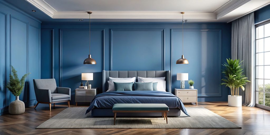
Blue: Calm, Focus, and Emotional Ease
Blue is widely associated with tranquillity and stability. Lighter shades create an airy, open feeling, while deeper tones like navy feel grounded and secure. Psychologically, blue can slow the heart rate and encourage relaxation, which is why it works so well in bedrooms and bathrooms.
In workspaces, softer blues can also improve concentration and mental clarity. However, very dark or cool-toned blues may feel distant if not balanced with warm lighting or natural textures.

Yellow: Warmth, Optimism, and Energy
Yellow carries the warmth of sunlight and tends to evoke positivity and energy. In kitchens and dining areas, it can create a welcoming, sociable atmosphere. In creative spaces, it may spark inspiration and mental stimulation.
That said, intensity matters. Soft buttery tones feel uplifting and gentle, while overly bright yellows can become overwhelming over time. The key is moderation and thoughtful placement.
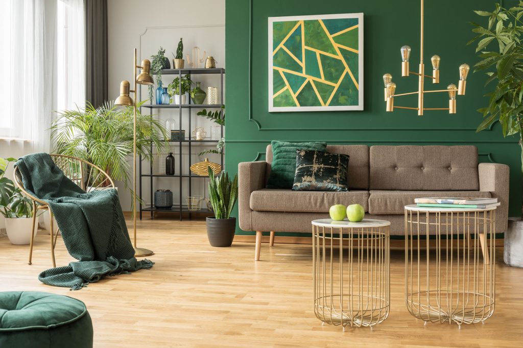
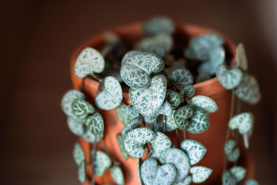
Green: Balance and Restoration
Green sits at the centre of the colour spectrum and is one of the most restful shades for the human eye. Because it is strongly linked to nature, it often promotes a sense of renewal and harmony.
Soft greens such as sage or eucalyptus can make a bedroom feel calm and restorative. Richer shades like emerald introduce depth and sophistication while still maintaining a sense of balance. Green is particularly effective in living spaces where relaxation and connection are priorities.
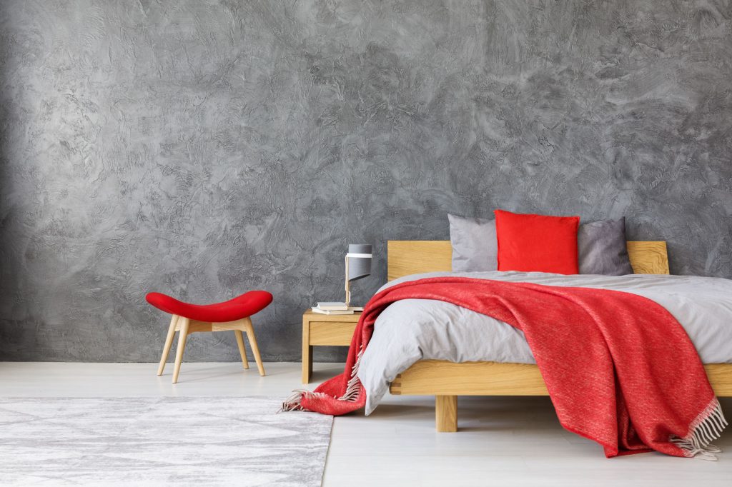
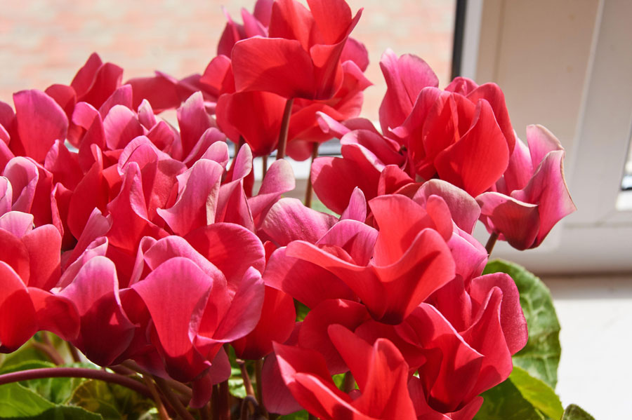
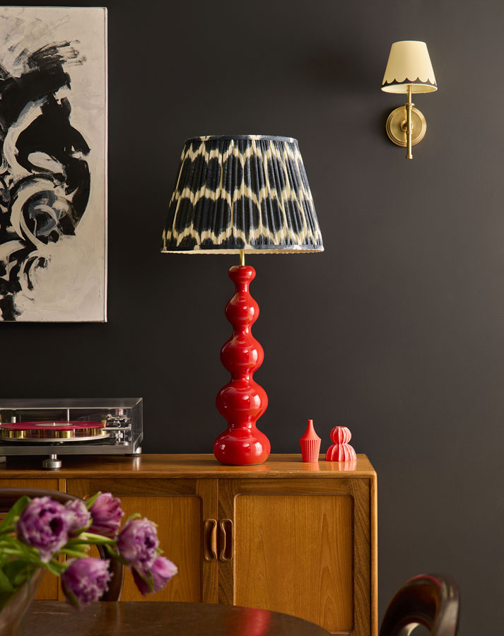
Red: Passion and Stimulation
Red is emotionally intense and physically stimulating. It can increase energy levels and encourage
conversation, which makes it well suited to dining rooms and social spaces.
Because red is so powerful, it is often most effective as an accent colour. Used thoughtfully — perhaps on a feature wall or in décor elements — it adds warmth and vibrancy without overwhelming the room.
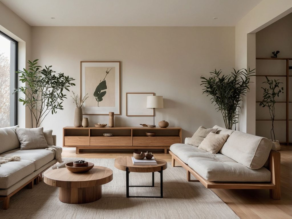
Neutrals: Space to Breathe
Neutral tones such as white, beige, taupe, and soft grey create a sense of simplicity and calm. They allow a room to feel open and uncluttered, offering visual rest in a busy world.
However, neutrals are not automatically soothing. Cool, stark whites can feel clinical, while overly flat greys may appear dull. Texture, layered lighting, and natural materials are essential to bring warmth and dimension into a neutral space.
The Power of the Overall Palette
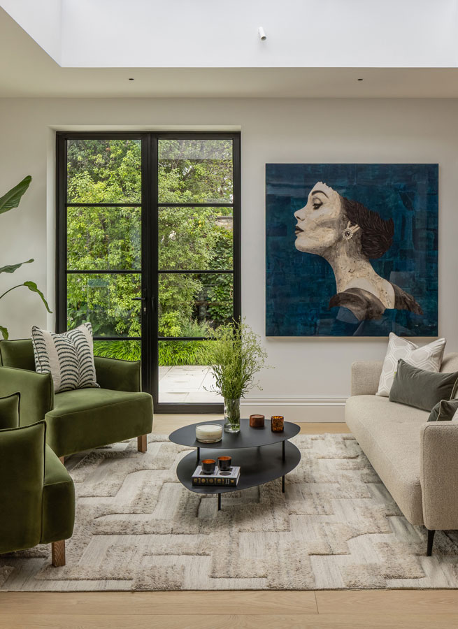
Individual colours matter, but the overall composition of your palette shapes the emotional atmosphere of a home. Cool-toned schemes tend to feel restful and serene. Warmer combinations create energy and sociability. High contrast adds drama and stimulation, while monochromatic layering produces cohesion and calm.
Lighting also plays a significant role. Natural daylight softens and clarifies colour, while artificial lighting can dramatically shift undertones. Testing samples at different times of day is always wise.
Designing with Intention
Choosing a colour palette should begin with a simple question: how do you want to feel in this space? A bedroom might prioritise calm and comfort, while a dining room might benefit from warmth and vibrancy. A home office may require clarity and focus.
When colour choices align with the purpose of a room, your home becomes more than visually appealing — it becomes emotionally supportive. Thoughtful use of colour can improve rest, boost creativity, enhance sociability, and create an atmosphere that feels authentically yours.
Ultimately, colour is not just decoration. It is a powerful tool that shapes your everyday experience in subtle but meaningful ways.


